- Category
- Health
- Native level
- Census tract
- Unit
- Years
- Vintage
- 2010-2015
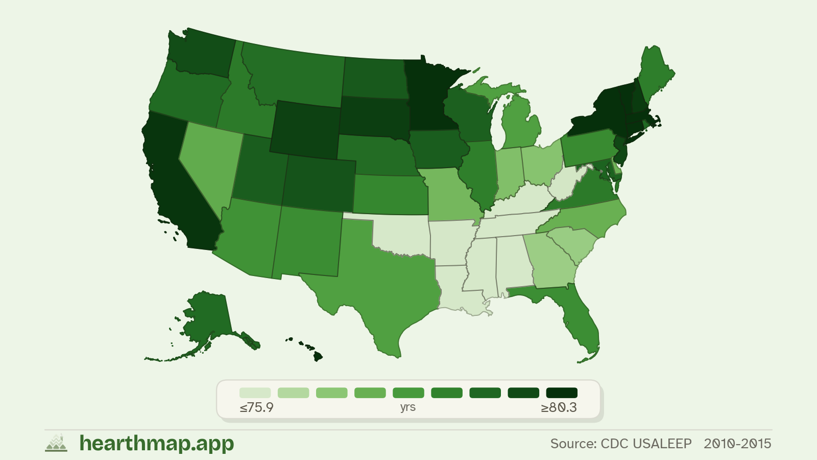
States ranked by life expectancy at birth
51 states with data (2010-2015). Top 10 highest and bottom 10 lowest.
| Rank | State | Value |
|---|---|---|
| 1 | Hawaii | 81.1 yrs |
| 2 | Vermont | 81.1 yrs |
| 3 | Massachusetts | 80.5 yrs |
| 4 | Minnesota | 80.5 yrs |
| 5 | New York | 80.5 yrs |
| 6 | Connecticut | 80.3 yrs |
| 7 | California | 80.2 yrs |
| 8 | New Hampshire | 80.0 yrs |
| 9 | South Dakota | 80.0 yrs |
| 10 | Wyoming | 79.9 yrs |
| Rank | State | Value |
|---|---|---|
| 51 | Mississippi | 74.8 yrs |
| 50 | Alabama | 75.1 yrs |
| 49 | Louisiana | 75.6 yrs |
| 48 | District of Columbia | 75.9 yrs |
| 47 | Tennessee | 75.9 yrs |
| 46 | Oklahoma | 75.9 yrs |
| 45 | Kentucky | 75.9 yrs |
| 44 | Arkansas | 76.0 yrs |
| 43 | West Virginia | 76.0 yrs |
| 42 | Georgia | 76.8 yrs |
About this map
hearthmap renders life expectancy at birth as a choropleth map of the United States. Zoom in to see census tract values shaded against the rest of the country, and click any region to see its exact value with margin of error.
You can layer filters and a custom match score on top of life expectancy at birthto find places that match what matters to you. Combine it with school ratings, housing prices, commute times, and more.
Source: CDC USALEEP · 2010-2015